
Label Solutions Art Upload Instructions
Supported/Preferred Artwork Formats
Adobe Photoshop (.tif files)
Adobe Illustrator (.ai or .eps files)
Adobe Acrobat (.pdf files)
Unsupported Artwork Formats
- Adobe Indesign
- Quark Express
- Microsoft Programs
General Document Setup
- Set Illustrator to CMYK Color Mode. (No RGB)
- Set Raster Image Resolution to 300ppi
- Set Raster Effects to 300ppi
- Any rasterized images should be at least 300dpi or higher at the size they are used in the label artwork. This will allow for a quality output label.
- Any bitmapped images should be at least 1200dpi or higher at the size they are used in the label artwork. This will allow for a quality output label.
- Make sure all colors used in your design are labeled clearly and properly within your files.
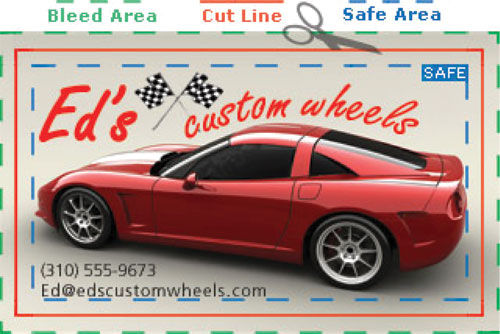
- Include between 1/16" and 1/8" Bleed Area for any graphics that extend up/past the edges of the Cut Line. This is to allow for a proper die cutting tolerance.
- Copy, logos, and graphic elements should have a 1/16" to 1/8" Safe Area away from the Cut Line.
Spot Colors
- Keep in mind that for Digital Printing, all production is done as CMYK, except for when white is required.
-
We recommend using spot colors for the following circumstances:
- Text, in order to maintain optimum legibility.
- Elements that require vibrant color. CMYK is only capable of reproducing a portion of the full color gamut “accurately.”
- When a label needs a color that cannot be accurately reproduced with CMYK inks, such as a precise color matching of a corporate or logo color.
- Metallic or fluorescent colors must be reproduced as a spot color. (Flexo)
Positive Type/Fonts
- Minimum type size: 5 pt
- Minimum rule / line size (stroke): .25 pt
- For best results, text should be created from one solid color.
- Text should always be created in vector format. Raster-based text will have jagged edges, making small text very difficult to read.
- On small type sizes (5 to 8 pt) use boldface, sans serif fonts. Register marks, Trademarks and Copyright marks (®,™,©) below 6 pt must be bold.
- Fonts must be converted to outlines, please keep in mind they are no longer editable.
- Avoid True Type Fonts.
Reverse Type
- Minimum type size: 6 pt
- Minimum rule / line size (stroke): .75 pt
- Minimum recommended for a channel or rule seperating two color areas is 1.5 pt.
- For best results, reversed text and objects should be created from one solid color surrounding the reversed area. (Flexo)
- It is always best if any reversed text is in a bold font.
Saving and Sending Files
- Always save a working copy with active fonts and a final copy with outlined fonts.
- Acceptable file media:
- E-mail: 30 MB or less
- Artwork Upload on our FTP site: ftp.labelsmadeeasy.com
- Use masking tools. Covering unwanted graphics with white-filled objects can lead to issues on prepress side. Remove hidden elements ( i.e. templates, old artwork, etc. )
- Delete unused colors from the color palette. Indicate any special match colors.